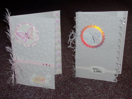
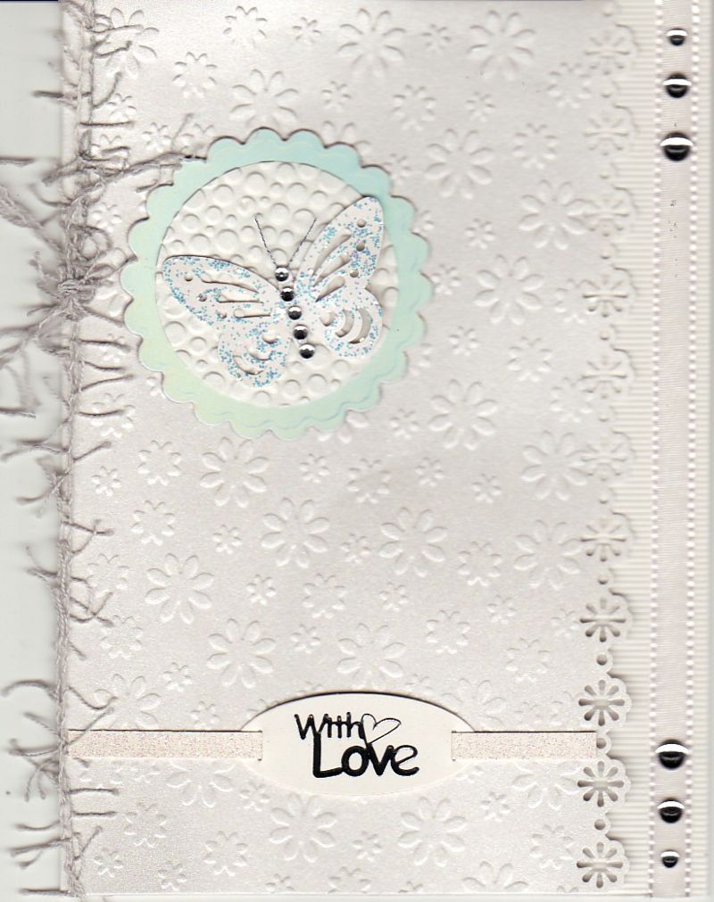
These two cards were made to a challenge of making a card based on a song title and I chose Procol Harum's
A Whiter Shade of Pale from 1967.
The left hand card is white with a little bit of pale pink and the right hand one is white with a little bit of silver.
Because the colours are all so pale the emphasis had to be on texture. Both cards are pearlescent white 5" x 7" and embossed with the Crafts Too daisy embossing folder, although I managed to get it the wrong way round for the pink card so it's inbossed.
On the silver version I used a Martha Stewart punch along the edge and placed textured paper and stuck ribbon along the edge of the behind. On the pink card I just trimmed the front edge and then added a strip of pearlescent pink floral insertion.
The pink butterfly was punched from textured pink pearlescent paper, layered onto white pearlescent paper and pink holographic paper die-cut with Nestabilities. The other butterfly is plain white, with Stickles glitter added and then layered onto embossed white and silver sheen card which looks pink in the photo and green in the scan.
The peel-off sentiments are mounted on Nellie Snellen diecuts with ribbon trims and both cards have an eyelash yarn and a few stick-on gems added to finish.
 |
 |